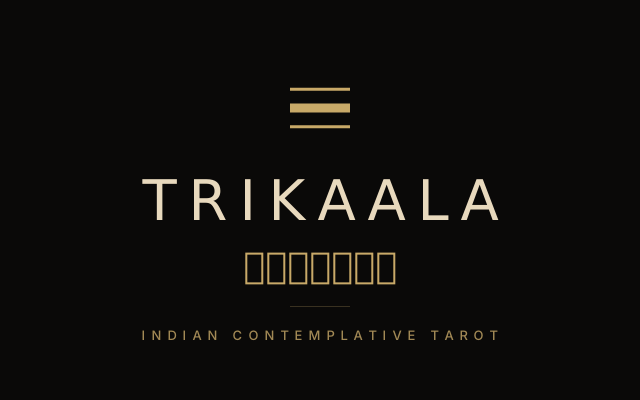
Why three lines.
Trikāla (त्रिकाल) is a compound Sanskrit word. tri (three) plus kāla (time). It names the three times the Indian contemplative traditions hold in attention: past (कारण — what was, the inheritance), present (वर्तमान — what is, in motion), and future (संभावना — what may be, the possibility). A practice named for the three times wants a mark that says exactly that. Three horizontal lines stacked vertically are the simplest possible geometry of three held together.
Why the middle line is thicker.
The middle line carries more visual weight than the outer two. This is the brand's structural argument rendered as geometry: the present is what the practice attends to. Past and future are present in every reading, but they are quieter. A reading in the Antardarshan Method does not predict the future and does not relitigate the past; it attends to what is on the table now. The mark says that without words.
The palette.
Midnight
#0A0908
Antique gold
#C8A968
Champagne
#E8D9BD
Ivory
#F8F4EB
Two working colours: midnight as the canvas, antique gold as the mark. Two supporting colours: champagne for emphasis, ivory for body copy. No accents, no secondary palette, no signal colour for alerts — the discipline is the small palette.
The lockups.
The mark composes with the wordmark in three standard arrangements. Each has a specific use.
Horizontal lockup. Mark on the left, wordmark on the right. The navigation header uses this. Source: /brand/lockup-horizontal.svg.
Vertical lockup. Mark above, Latin wordmark, Devanagari. Used on square surfaces — splash screens, social profile cards, app icon supplementary views. Source: /brand/lockup-vertical.svg.
Full lockup. Mark + Latin wordmark + Devanagari + tagline ("Indian contemplative tarot"). For letterhead, the OG share card, press releases, slide title cards. Source: /brand/lockup-full.svg.
Clearspace and don'ts.
The minimum clearspace around the mark equals the height of the middle (thick) line — roughly one-tenth of the mark's overall height. Anything tighter and the mark loses its weight.
- —Don't recolour the lines (gold + midnight only)
- —Don't stretch the mark non-uniformly
- —Don't rotate the mark (it reads as a horizon line; rotation breaks the metaphor)
- —Don't add drop shadows, embossing, or skeuomorphic effects
- —Don't pair the mark with a tagline other than "Indian contemplative tarot" or "the Antardarshan Method"
Files.
The full asset library — SVG masters plus PNG exports at every standard size, plus the favicon stack — lives at /brand/. The library README documents every file's intended use:
/brand/README.md · mark.svg · lockup-horizontal.svg · lockup-full.svg